Building a website with AI
when the brand is you.
I built a website to show how I think about marketing. Here’s how I directed an AI team through positioning, content, design, coding, and the decisions that got it ready to launch.
I wanted a project of my own: a website where people could get to know me, understand the experience behind my opinions, and find something worth reading. Somewhere to share what I know about marketing, write the longer pieces I enjoy, and experiment with ideas. So I built Anna on Marketing with an AI team. I became the client, marketing lead, editor, and art director. Occasionally, the tester too. There was plenty to do.
I wasn’t aiming for thousands of visitors a day. I wanted people to understand how I think and find something useful in what I share. Building the site gave me a chance to put my own approach to work, from deciding what belonged on the homepage to checking whether a table was readable on a phone.
AI had reached a point where I could use it to get a project like this built quickly. And I had enough experience to direct the work. I’d worked with business leaders to turn their ideas into marketing strategies, then with designers, developers, editors, and fellow marketers to put those strategies into practice. That meant making decisions about both the direction and the details. This time, the vision was mine, and I knew enough to question what came back and explain what needed to change.
I orchestrated the project, with ChatGPT and Claude as my team. They helped me plan, design, write, build, and review the site. I wrote parts of the copy, brought references, challenged suggestions, and asked for alternatives. They contributed ideas that changed my mind, too. I edited and refined the copy, the layout, the structure, and how things worked. Then edited and refined some more. We worked through whole sections and individual words, sometimes repeatedly. Apparently, being your own client doesn’t make approvals any quicker.
Why should anyone read me? Planning the homepage
The homepage had to explain what differentiates me, professionally and personally, and why my perspective might be worth your time. I wanted to convey the breadth of my marketing experience and the depth of my expertise in strategy, digital, growth, and content. Preferably without listing every marketing function or writing several screens of how wonderful I am. An interesting brief when you’re also the client.
The page needed to tell a story, and the order mattered. “How I think” comes before my career history: I wanted readers to understand my approach first.
For the experience section (“How I got here”), we built a sentence readers could explore, with each phrase opening a short chapter about the experience behind it. The interactive format was an AI suggestion. I hadn’t asked for it, and I doubt I would have thought of it myself. It connected the different parts of my career and let readers choose how much detail they wanted. The full job history could stay on LinkedIn.
A closer look at the homepage decisions
| Section | Marketing purpose | The decision |
|---|---|---|
| Opening introduction | Positioning | Introduce me as a marketing strategist and leader in tech, with both breadth of experience and specific areas of depth. |
| Who I write for | Audience and value | Give the people I want to reach a reason to read: thinking they can question, apply, and use in their own work. |
| How I think | Approach | Put my thinking before my career history, so readers meet the approach before the chronology. |
| How I got here | Relevant experience | Connect the chapters of my career through what I learned, with details readers can choose to open. |
| What to read and Lab Notes | Evidence of the work | Give readers somewhere to see my approach in practice, through articles and experiments. |
| In their words | Social proof | Include perspectives from someone who managed me, a colleague, and someone who reported to me. |
| Off the clock | Personal touch | Use my own photographs and stories to show the person behind the work. |
| Get in touch | A next step | Make room for feedback and conversations about working together. |
How I ran the project
I gave ChatGPT and Claude different responsibilities. ChatGPT and I focused on positioning, content, and editing. Claude led the build and design, and contributed copy and editorial feedback too. I used each to review the other’s work: ChatGPT reviewed layouts, while Claude reviewed our copy in the context of the page. I assessed the feedback and decided what to take forward.
Building a working library
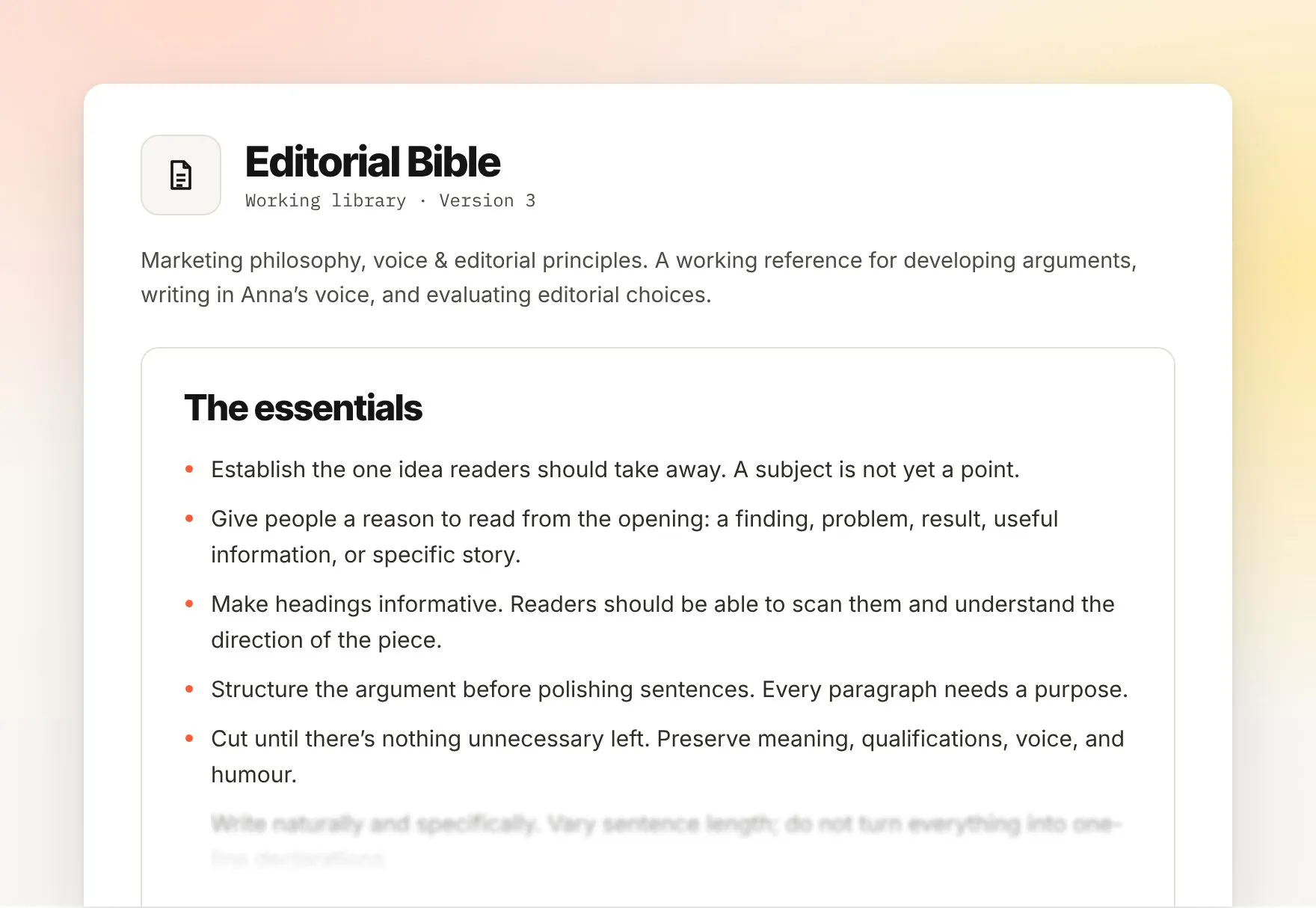
I already had a document capturing my marketing philosophy and initial editorial principles from earlier work with AI. We developed it into an Editorial Bible and created other documents as the project took shape. Together, they became a working library, with a specific purpose for each document:
- Editorial Bible: my marketing philosophy, voice, and editorial principles, with examples of what I’d kept, rejected, or changed, and why.
- Page and content briefs: the purpose, audience, structure, and requirements for the work.
- Style guide: shared rules for typography, spacing, photographs, and consistency across pages.
- Handoffs and decision notes: approved copy, agreed changes, implementation notes, and questions still to resolve.
I explain some of those editing principles in Writing with AI? Think like a journalist.
Review, refine, repeat
After noticing inconsistencies between pages, I asked Claude to run a wider check. We agreed rules for heading sizes, spacing, and line breaks, then added them to the style guide. That gave future reviews specific things to check, including how a heading should break by meaning on a smaller screen.
I also reviewed the suggestions critically. One suggestion was to remove an orange text highlight in “How I think”. I kept it: without that accent, the section would become a long stretch of text with little to draw the eye. The feedback made me look at the layout again. I still preferred it with the highlight.
Throughout the project, I kept zooming in and out: refining a word or a line break, then stepping back to read the page as a visitor would. I checked desktop and mobile, where the same content could feel very different. Could someone skim the headings and follow the story? Was the table readable? Did a small improvement to one element make the section harder to use? Those checks often gave us the next change to make.
Moving the workflow into Notion
As the project grew, I was spending too much time carrying files and replies between chats. We moved the working library into Notion, with one master copy of each document, an owner, and a version number. A shared handoff board records what needs a response, what has been answered, and what has been completed.
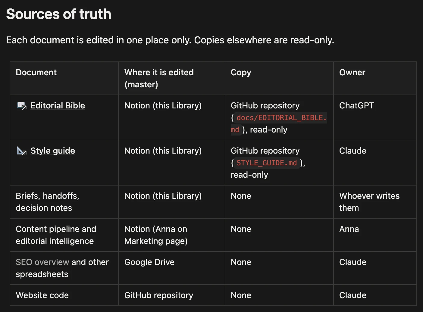
ChatGPT and Claude can now read the same references and leave replies in the same workspace. I still prompt them to pick up a handoff, decide which suggestions to accept, and approve what goes live. Having a reply waiting is not the same as having an approved change. I wanted less copying and pasting, while keeping those decisions mine.
During setup, I also felt I was reaching my AI usage limits faster. I hadn’t measured whether the new workflow was responsible, but it gave me another reason to keep the process light: group related edits, and don’t turn every small correction into a separate handoff.
Vibe coding: a site I could run and maintain
Why did I vibe-code the website? Because I could. I had a clear idea of what I wanted, and an AI team that could help me build it. For this project, that was a practical way to get from an idea to a working site.
I’ve worked with larger websites using WordPress, HubSpot CMS, and headless CMS setups. For my own site, I wanted something that suited a smaller publishing volume, gave me flexibility in how I presented each article, and kept costs and maintenance manageable. Reliability, security, and privacy were part of the brief.
Between my imagination and everything I knew we could add, this could easily have become a much bigger project. I needed to stay grounded: what would meet my needs now, and what could wait?
Three decisions that kept the build manageable
- Keep publishing simple, with room to adapt the layout. We used Astro to build finished pages from content files and reusable design components. With relatively few articles to publish, I could work with Claude on an article’s layout, tables, and expandable sections, while keeping them consistent with the style guide. For now, adding a content file works for me. A more convenient editor can follow when publishing that way becomes a nuisance.
- Make it easy to get in touch. I wanted readers to send feedback or ask about working together, without putting my email address directly on the page. My experience with HubSpot made it a practical choice for managing those messages. We built forms that matched the site’s design and sent submissions there, with validation and spam protection. The implementation also avoided loading HubSpot’s tracking script on the pages.
- Keep hosting and measurement straightforward. I chose Cloudflare for both the domain and hosting to keep administration and running costs manageable. Cloudflare Web Analytics is working, and Search Console is connected to monitor search visibility after launch. I can build on that setup when I need more detailed measurement.
How I reviewed changes without reading the code
Claude wrote the code. I reviewed the content, design, and how the site worked. I opened and merged pull requests in GitHub, judging changes from preview links, screenshots at different screen sizes, and the live site after merging. Claude checked builds and layouts; I reviewed pages on my laptop and phone, tested interactions, and requested changes. A malformed content file once made a preview build fail, so we caught it before it could reach the live site. That was a useful check, although a successful build cannot tell me whether a page makes sense to a reader.

I wanted AI to take on as much of the work as was useful, while keeping control over what went live. I handled account setup and settings that needed my access, tested the experience, and approved releases. Some manual steps were simply practical; others were decisions I wanted to keep making myself.
Security needed its own checks
Working at a cybersecurity startup had taught me to take website security seriously. That influenced both the brief and the checks: how credentials were handled, what the forms collected, how submissions were protected from abuse, and which account settings needed attention. Claude reviewed the implementation it could access and guided me through checks in dashboards it couldn’t. It wasn’t an independent audit, but security was something we checked, not something we assumed.
Tech specs and checks at a glance
| Area | The setup | The detail behind the decision |
|---|---|---|
| Site and content | Astro, a web framework, builds pages from content files and reusable design components. Code and content sit in a GitHub repository. | Publishing currently means editing files. The CMS configuration exists, but login is not set up yet. |
| Hosting | Cloudflare handles hosting and domain registration. | Most pages are static files. Only the form endpoint runs server-side code; the site has no database. |
| Forms | Custom forms send validated submissions to HubSpot. | Spam checks and input limits run before forwarding. The forms still need maintenance, even on a static site. |
| Builds and previews | Build and content checks, plus layout and interaction checks. | Preview builds sometimes stalled. Screenshots and live-site checks also informed revisions. There was no separate automated test suite. |
| Analytics | Cloudflare Web Analytics, with Search Console connected. | Visit data cannot establish whether an article was read. More detailed measurement can follow when I have a useful question to answer. |
| Technical checks | Code, repository history, dependencies, build configuration, and dashboard checks. | These included checking the history for exposed credentials and dependencies for known vulnerabilities. I handled dashboard checks where Claude lacked access. |
How I decided the site was ready to launch
The site was already online while we worked on it. I could open it on my laptop or phone, test it, and share it with a small group of people. It was set to noindex, so it wasn’t intended to appear in search results. Launching meant opening it to search engines and introducing it to a wider audience.
Before doing that, I wanted the homepage and About page in good shape, and a few things worth reading. If I was going to invite you over, I wanted to give you something to explore.
There was always another sentence to sharpen or a layout to adjust. Working in startups had taught me to decide what the first version needed to do, and what could wait. The site needed to show how I think, offer useful material, and make it easy to get in touch. That set the criteria for my MVP.
I still found small problems on mobile and asked for changes to spacing and heading breaks. Fixing them didn’t mean reopening the whole project. We could keep improving the site while moving on to the next article. At some point, “a gazillion edits later” had to become a footer joke rather than a project plan. (Check the bottom of the About page.)
What comes after building the site?
I already used AI in my work and everyday life. This project brought several kinds of work together around something I wanted to create for myself. The brief, shared references, feedback, and decisions about what to change or leave alone were familiar parts of running a marketing project. I’d used that approach many times before. Here, it helped me direct an AI team through the work.
And I loved it. There was real pleasure in seeing an idea become something I could open, click through, and improve while I was still excited about it. AI helped me move quickly between imagining something and trying it. Having a way to organise the work made that freedom useful. It kept my evenings and weekends busy, but I really enjoyed it.
Now I have somewhere to publish, experiment, and share what I learn. The next job is to give you a reason to come back.